
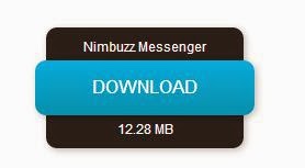
Hello friends one week ago . I was just seeing some CSS3 buttons I saw a cool animated download button made by Design Shack.net. This is a very Awesome work . This is a very Awesome work. this is pure Css3 work without images and javascript. it's really helpful for game and software blogger . So now watch the demo of this pure Css3 button.
Adding CSS3 code in the Template
1: Go to Blogger Template -- Edit ---HTML---and Search the code </b:skin> and paste the below and save
style>
.abt-button {
margin: 50px auto;
width: 200px;
}
/* Get this button at ITGlobalapps.blogspot.com */
.abt-button a {
background: -moz-linear-gradient(center top , #00B7EA 0%, #009EC3 100%) repeat scroll 0 0 transparent;
color: white;
display: block;
font: 17px/50px Helvetica,Verdana,sans-serif;
height: 50px;
text-align: center;
text-decoration: none;
text-transform: uppercase;
width: 200px;
position: relative;
z-index: 2;
/*TYPE*/
color: white;
font: 17px/50px Helvetica, Verdana, sans-serif;
text-decoration: none;
text-align: center;
text-transform: uppercase;
/*GRADIENT*/
background: #00b7ea; /* Old browsers */
background: -moz-linear-gradient(top, #00b7ea 0%, #009ec3 100%); /* FF3.6+ */
background: -webkit-gradient(linear, left top, left bottom, color-stop(0%,#00b7ea), color-stop(100%,#009ec3)); /* Chrome,Safari4+ */
background: -webkit-linear-gradient(top, #00b7ea 0%,#009ec3 100%); /* Chrome10+,Safari5.1+ */
background: -o-linear-gradient(top, #00b7ea 0%,#009ec3 100%); /* Opera 11.10+ */
background: -ms-linear-gradient(top, #00b7ea 0%,#009ec3 100%); /* IE10+ */
background: linear-gradient(top, #00b7ea 0%,#009ec3 100%); /* W3C */
filter: progid:DXImageTransform.Microsoft.gradient( startColorstr='#00b7ea', endColorstr='#009ec3',GradientType=0 ); /* IE6-9 */
}
.abt-button a, .abt-button p {
-webkit-border-radius: 10px;
-moz-border-radius: 10px;
border-radius: 10px;
-webkit-box-shadow: 2px 2px 8px rgba(0,0,0,0.2);
-moz-box-shadow: 2px 2px 8px rgba(0,0,0,0.2);
box-shadow: 2px 2px 8px rgba(0,0,0,0.2);
}
.abt-button p {
background: #222222;
color: #FFFFFF;
display: block;
font: 12px/45px Helvetica,Verdana,sans-serif;
height: 40px;
margin: -40px 0 0 10px;
position: absolute;
text-align: center;
transition: margin 0.5s ease 0s;
width: 180px;
z-index: 1;
/*TRANSITION*/
-webkit-transition: margin 0.5s ease;
-moz-transition: margin 0.5s ease;
-o-transition: margin 0.5s ease;
-ms-transition: margin 0.5s ease;
transition: margin 0.5s ease;
}
.abt-button:hover .up {
margin: -5px 0 0 10px !important;
}
.abt-button:hover .down {
line-height: 35px !important;
margin: -85px 0 0 10px !important;
}
.abt-button a:active {
background: #00b7ea; /* Old browsers */
background: -moz-linear-gradient(top, #00b7ea 36%, #009ec3 100%); /* FF3.6+ */
background: -webkit-gradient(linear, left top, left bottom, color-stop(36%,#00b7ea), color-stop(100%,#009ec3)); /* Chrome,Safari4+ */
background: -webkit-linear-gradient(top, #00b7ea 36%,#009ec3 100%); /* Chrome10+,Safari5.1+ */
background: -o-linear-gradient(top, #00b7ea 36%,#009ec3 100%); /* Opera 11.10+ */
background: -ms-linear-gradient(top, #00b7ea 36%,#009ec3 100%); /* IE10+ */
background: linear-gradient(top, #00b7ea 36%,#009ec3 100%); /* W3C */
filter: progid:DXImageTransform.Microsoft.gradient( startColorstr='#00b7ea', endColorstr='#009ec3',GradientType=0 ); /* IE6-9 */
}
.abt-button:active .up {
margin: -20px 0 0 10px !important;
}
.abt-button:active .down {
margin: -70px 0 0 10px !important;
}
</style>
Adding HTML code in post
2:So as we have added the CSS we just need to add the HTML in the post So whenever you want to add this button to your post just paste the HTML code . we want need.
<div class="abt-button">
<a href="#">Download</a>
<p class="up">click to begin</p>
<p class="down">1.2MB .zip</p>
</div>
Post a Comment